 Mobility
Understanding mobility patterns is important for urban and transportation planning, as well as for development of smart city initiatives. It’s also relevant for migration studies, epidemiology, ecology and disaster response. At our company, Teralytics, we help transportation planners and mobility providers meet people’s ever-changing travel needs, and we use exploratory visualization tools to bring to life our mobility insights.
In the mobility domain, the goal of data analysis is often to inform planning decisions, such as where to expand a mobility service or how to encourage people to use alternative modes of transportation to alleviate pressure across the network, improve journey times, or cut carbon emissions.
For many use cases in this context (e.g., for the analysis of travel demand and modal split), information is stored in the form of Origin-Destination (OD) data. OD datasets represent aggregated movement count between pairs of geographic locations.

Origin-Destination data example
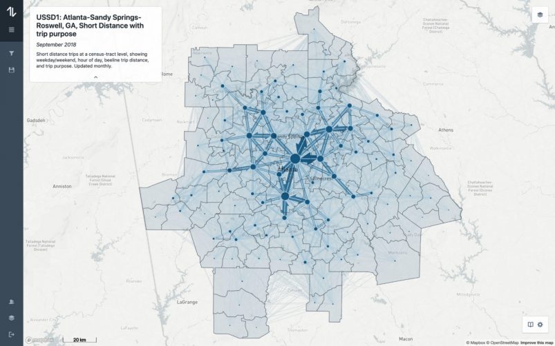
There aren’t many analysis tools currently available that are designed specifically for this kind of data, and even fewer are easy to use. We decided to publish several open-source tools and libraries for OD data analysis. One of these tools, Flowmap.blue, is targeted mostly at non-expert users. The tool makes it very easy to create interactive geographic flow maps from datasets uploaded to Google spreadsheets. Since we published it a few months ago, hundreds of datasets from all around the world have been explored with it. The tool has been used by transportation planners, urban planning agencies, mobility operators, NGOs, researchers, historians, biologists, epidemiologists. It became quickly apparent that the tool offered a solution to a real problem. I’m also very pleased that the tool has recently won an award at the prestigious Information is Beautiful Awards.

Commuters in the Netherlands in Flowmap.blue
To be useful, any exploratory data visualization tool must fulfill two basic requirements: the representation must be readable and informative, and the interactions responsive. The OD datasets we work with at Teralytics have billions of records, which makes it challenging to meet these requirements.
We use flow maps as the main geographic representation of OD data. They represent volume of movements between locations, depicted as lines of varying thickness drawn on a map. Flow map is the most straightforward and often used representation of OD data, but it has limitations. Depending on the nature of the dataset and the number of lines drawn, there can be a significant overlap caused by the line crossings. We apply a number of visual techniques to alleviate this problem: sorting the flow lines by magnitude, fading out the smaller flows, blending with the underlying base map to make it legible, and drawing flow line outlines to prevent the arrows from merging into a single blob of color. But even when using these techniques some datasets with complex movement patterns are not clearly readable.

Rendering of a flow map with fading of the smaller flow lines
Another issue is that short flows can be difficult to see. These are often also the largest ones, since close-by regions are usually better connected than those which are far apart. The more locations and flows are in the dataset, the more complex the issue.
To address these challenges, we implemented an adaptive clustering approach. Locations within a certain distance from each other (the distance depends on the current map zoom level) are clustered together. The clusters are positioned at the center of location masses constituting them (the locations are weighted by their total in/out flows). After the location clusters are formed, flows are aggregated by summing up the magnitudes of the flows connecting the constituents of the clusters.

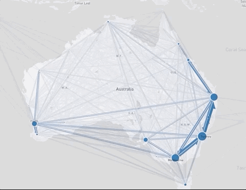
Bus journeys in São Paulo (top) and relocations in Australia (bottom) before and after applying the clustering
The clustering level adapts to the map zoom making sure that not too many flows need to be drawn, and that all the drawn flows are not too short. Flow lines which are too short are summarized as cluster-internal flows; these are represented as part of the location totals by the circles of varying sizes. When zooming in, the clusters will gradually expand, so the level of summarization will automatically adapt to the map zoom level.
For the clustering, we used a simple and efficient density-based algorithm implemented in the Supercluster library.
The size of an OD dataset depends quadratically on the number of locations involved. Often, flows in OD datasets have additional attributes — e.g. time, distance, duration or mode of transport. This is useful for exploring differences between types of flows, or for comparing movement patterns emerging at different times.


We looked for a database solution which would show good performance for analytical queries for very large OD datasets. We chose ClickHouse, which is a scalable column-oriented database supporting SQL as its query language and is designed to perform especially well for data aggregation over large tables. If you are looking for a detailed benchmark of ClickHouse for mobility data here is a very good article by Mark Litwintschik.
The powerful combination of the scalable OD-data visualization and the fast database makes it possible to explore and analyze large OD datasets. We open-sourced Flowmap.query, a web application demonstrating the techniques we discussed above:

We’re excited that the response to our open-source OD analysis tool Flowmap.blue has been so positive. We hope that by making such tools available to everyone, we can help teams across the world solve for the various real-world challenges, where understanding of people’s mobility patterns is integral to finding workable solutions.
If you’d like to explore further, check out:
An easy to use flow map visualization tool:
http://flowmap.blue
Demo web application showcasing the use of ClickHouse and adaptive clustering:
https://github.com/teralytics/flowmap.query
A JavaScript library for flow map rendering:
https://github.com/teralytics/flowmap.gl
Scalability challenge of OD data visualization:
https://www.youtube.com/watch?v=Cr6JtLRmSa8
